If you’re anything like me, you’ll appreciate how long, dense and wordy reports compiled by advocacy organisations aren’t always the easiest way for the average punter to learn about a new topic.
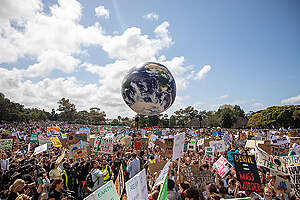
But if you’re into infographics, data visualisation, and creative maps as a way to demonstrate the sheer enormity of the issues facing the planet today, then you’ll be happy to know that this area of work is flourishing today like never before.
This growing trend is detailed in a new book, Visualising Information for Advocacy, compiled by Tactical Tech. It’s a fantastic addition to anyone’s coffee table, best read by anyone interested in how data, when presented in stunning infographics, can help transform how non-governmental organisations and advocates communicate their campaigns.
This practical and informative guide presents inspiring case studies across a range of issues. One of my favourite examples came from Save The Children, where a “childrens world map” was created to highlight the countries where children’s rights were best and worst protected.
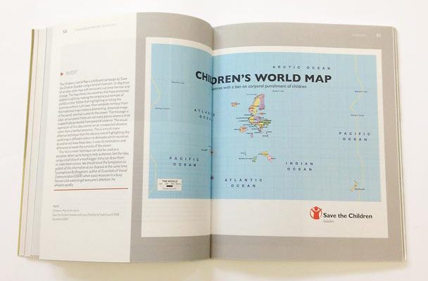
Childrens’ Map of the World, created by Save the Children Sweden and Linus Östholm & Fredrik Lund/DDB Stockholm 2008
The topics cover a range of disciplines, from corruption to child rights to violence against women to forced labour and of course environmental issues. Even Greenpeace gets a mention for our work highlighting the deadly effects of plastic pollution and destructive deforestation in Indonesia.
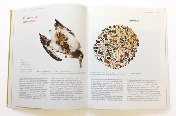
Campaign poster by Greenpeace with Publicis Mojo Auckland. Photograph of an albatross chick, copyright David Liittschwager, 2005. Photograph of stomach contents, copyright Susan Middleton, 2005.
The book analyses the range of techniques designers are using to unravel connections which make these visualisations successful. These include subversion (where viewers are shown something recognisable and the meaning flipped) and correlation (where graphics compare variables to help viewers get the picture).
The book also looks at a spectrum of communication styles, from heavy visual graphics to those that are lighter on the design but highly reliant on data.
Last year I was lucky enough to attend some workshops by the team who put this book together. I was blown away by their in depth knowledge on this specialised topic. This book was developed as a result of nearly 50 such workshops with activists, journalists and advocates from around the world.
If you’re interested in starting some of this work yourself, the authors also share tips and advice on planning and designing visual campaigns, telling stories through words and images – and provides a useful guide with tools and resources for you to get started right away.
The book is available to purchase from Tactical Tech’s website.